Telus BlackBerry Storm 2 Review
Introduction
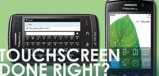
The enormous success of the iPhone, since its release in 2007, sent a lot of phone competitors back to their drawing boards to create a competitor that included one of the iPhones primary features, a large touch screen. Though none of them would admit to trying to create an iPhone killer, the media quickly dubbed them as such. Research in Motion (RIM), the Canadian creators of the ‘Crackberry’ had already made major in-roads into the consumer smartphone market with their Curve and Pearl entry level phones, but the meteoric rise of the iPhone surely put pressure on them to have an answer to it. However not only did RIM want to have an answer they wanted to better the iPhone. What resulted was the Blackberry Storm, released in Dec 2008 in Canada.
The Storm though was considered a failure, and never caught on in the marketplace. RIM had decided to reinvent the wheel when it came to the screen – they tried to combine the best of a touch screen and a physical keyboard with their Sure-Press technology. While an innovative idea, version 1.0 of Sure-Press didn’t work as well as advertised, and many users found it difficult to use. The Storm’s operating system, OS 4.7, was quite behind the times compared to other touch screen Smartphone OS’s, and sadly the version the Storm initially shipped with had quite a few bugs, leading to a lot of users giving up on the phone before RIM had time to fix things. The Storm also had no Wi-Fi, and a few other minor irritants, such as a poorly design battery door.
Fast forward a year later – RIM hasn’t thrown in the towel, and after having learned some valuable lessons from the Storm, they released the Storm 2. Telus was kind enough to send us a review unit, and I got a chance to spend a week with it as my primary phone.
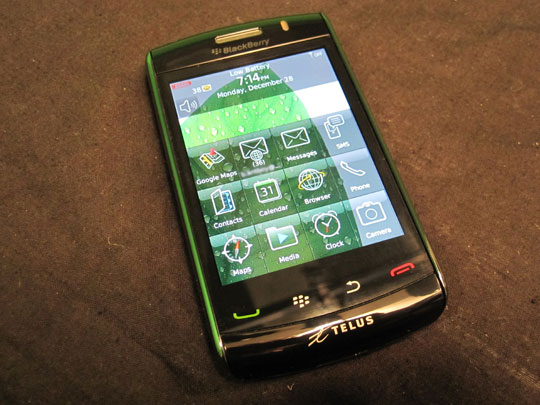
I will preface this review with a few comments: RIM has addressed nearly every issue that people complained about on the Storm 2, making a much better phone – if I had to pick from any of RIM’s currently line up, the Storm 2 would easily be my first choice since there is a lot to like in this phone, but dissapointingly, like the Storm, still suffers from some of the fundamental flaws that affect all Blackberries, which in its form factor are magnified to be even more frustrating.
Storm 2 Spec List:
• Enhanced SurePress Technology
• Wi-Fi 802.11 b/g
• Bluetooth stereo audio
• 256 MB Flash Memory
• 2 GB Onboard Media Memory
• Integrated touch navigation keys
• BlackBerry OS v5.0
• 3.2 MP Digital Camera w/flash & autofocus and video recording
• 3.25”480 x 360 pixel capacitive colour display
• 3.5mm stereo headset jack
• Dual-band: 800/1900/ MHz CDMA/Ev-DO Rev A
• Integrated GPS with assisted-GPS capabilities and Blackberry Maps
• Included accessories : Travel charger, International roaming SIM card, Premium stereo headset & 16GB micro SD memory card
Hardware – design
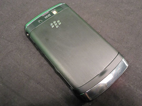
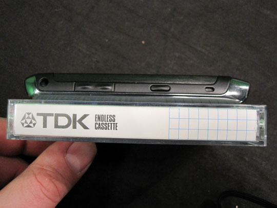
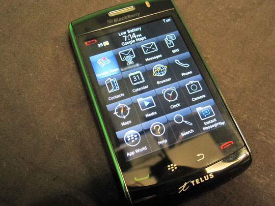
One of the hallmarks of RIM’s phones has always been the incredible build quality, and the Storm 2 certainly does not disappoint in that respect. The Storm 2 is a very good looking phone, and with the quality of the materials used, fit and finish it certainly looks like a higher quality (and yes more expensive) device than any of its competitors, including an iPhone. The handset has a heft, a solid feeling, that many other Smartphones lack, with chrome metal accents, and a metal battery door. The overall design of the original Storm, which was already very nicely designed, has been carried forward, and the Storm 2 design addresses many of the minor complaints about the original, such as moving the speaker to the bottom from the back, improved rubberized side buttons, and better fit of screen, with the core buttons integrated into it (which did actually cause one problem for me that will be detailed later). For the corporate executive, who wants to impress, the Storm 2 won’t disappoint. However, conversely, this executive appeal might actually be unappealing, for people looking for something ‘cooler’. I personally love the look and design of the phone, but there is a penalty for this heft and build quality, making the Storm 2 is one of the largest and heaviest smartphones on the market, and while it is only technically a few millimeters thicker than an iPhone it just feels bigger, and it is a noticeable 25 grams heavier.
The positioning of the screen, and therefore the four buttons below, is a problem for one handed operation – it is a little hard to hit the buttons with your thumb while holding the phone, and if the screen had been placed a little above dead centre the additional room below it may have helped with that. Lastly one major difference between the Storm 1 and 2, and all other RIM phones, is the lack of a trackball, or the new optical trackpad. In itself this should not be a big issue, since clearly touch screen is supposed to be the primary way to navigate around the phone but, unlike its competition, the OS is not fully optimized for a touch screen interface, and there were many times where having the trackpad would have helped greatly with navigation. (Of course this is an OS specific problem future software updates could address with UI improvement.)
Overall though I would have say from a design standpoint the Storm 2 is one of the best looking and well-designed Smartphones available today.
Screen
One of the major differences between the Storm 1 and 2, and all other touchscreen phones on the market, is RIM’s propriety SurePress technology, designed to be closer to using a traditional physical interface. With SurePress you first use the capacitive screen to highlight the icon, or button you want, and then you actually press the screen down to activate it. On the Storm 1 the SurePress screen was widely dismissed as good in theory, but poorly executed, and initial rumours about the Storm 2 were that RIM would abandon the technology in favour of a more traditional capacitive touch screen. Instead RIM redesigned SurePress. One of the main problems with the first generation was that the button was one button underneath the centre of the screen, which was mechanically pressed down when using it. In practice that led to issues of having to press harder to register a click when using the screen at the corners and edges. On the Storm 2 this system has been replaced by four piezoelectric buttons, one at each corner. This immediately addressed the Storm’s side and corner issues, and also, since these buttons are electric, when there is no power the screen cannot be clicked. This, along with the new proximity sensor, fixes one the other problem the Storm had – your face or ear pressing on the screen and activating something unintentionally during a call. Lastly the rebound action of the click has been improved which is supposed to make for a better typing experience.
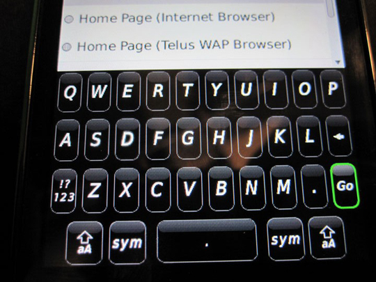
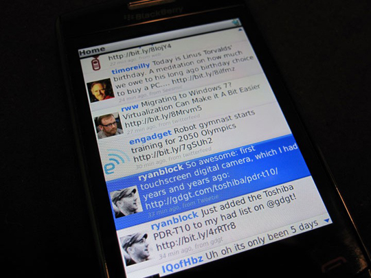
How does this screen technology then compare to other touchscreen phones, such as the iPhone or the Hero? Surprising a lot better than I thought it would. I was predispositioned going into my hands on with the Storm 2 to hate the SurePress screen after all the poor press the Storm received, thinking that the click would be a gimmick, and I was pleasantly surprised. Like any new interface there is a learning curve, more so with the Storm 2’s totally unique screen, and it took me a few days to get used to it, but once I did I actually grew to love it. The fact that I could move my finger around the screen to highlight what I might be interested it before I actually pressed to select it worked great, and typing on the screen, especially in landscape mode was very easy, and felt almost as good as a physical keyboard. Also scrolling did not require a click, just a normal flick like other phones – once you arrive at the destination you just needed to highlight your option and click – this worked great in UberTwitter, an excellent twitter app that works very well on the Storm 2. I would though have liked an option to selectively disable SurePress, since for on screen buttons, large icons and the keyboard it is a perfect solution, but there some application when it gets in the way.
Despite all my praise for the SurePress screen and technology it is still let down by the Blackberry OS. While I found the screen excellent for selecting finger friendly buttons, and controls, there were still deeper layers in the OS, and apps, that were never designed to be used by a touchscreen – the buttons and menus are simply too small, and having to select some tiny text box, then click to select it, became a chore.
On the Storm 2 the menu, back, send and end buttons are now integrated into the screen, so when there is no power they do not press down. One problem with this design though is since these buttons rely on the four corner switches that the screen use, which are in the corners too, the send and end key do not work if pressed in at the very corner of the screen, which often happened to me when using the phone with one hand, using my thumb on the buttons. Once I got used to where I had to press it was no longer an issue – and this problem could have been something that only affected the phone we were testing.
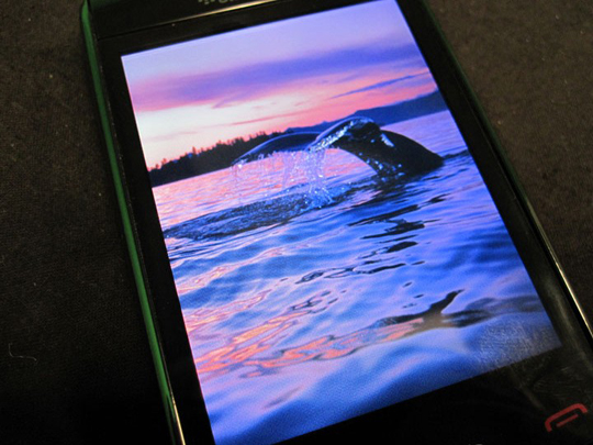
The other features of the screen, such as its resolution and clarity, are very good, but not top of the line – it has a 480 x 360 screen which is slightly better than the iPhone, but not as crisp as some of the WVGA screens found on other phones like the HTC Touch Pro 2 and Nexus 1. However video playback still looked very good, with great contrast and colour reproduction.
Hardware – Sound, Battery, included Accessories and other specs
Trackpad (or lack thereof):
As detailed above the screen with its SurePress 2 technology is actually really good, sometimes there are parts of the UI that simply don’t like a touch screen. What is missing is the optical track pad from the Blackberry Bold 9700. If that was present below the screen it would be perfect for one handed navigation, since the screen is a little too big to use the touch screen with one hand properly. More importantly it would have helped with moving around and smaller items in the UI that don’t work too well with SurePress. I am sure part of the reason why it was left off, and why there is no trackball on the Storm 1, is aesthetics, but I hope that RIM might add it to the Storm 3.
Processor:
When you try and find out information about what processor the Storm 2 uses there is nothing RIM’s website. Unlike other high-end smartphones, which brag about their processing power, RIM does not – why I can only speculate, perhaps because apparently the Storm 2 user the same Qualcomm MSM7600 528 MHz processor as the 1 year old Storm. Suffice to say this means that the processing power of the Storm 2, compared to its major competitors, the iPhone 3GS, Motorola Milestone (Droid in the US), and Nexus 1 is quite lacking. Luckily Blackberry OS 5 does not press the processor hard with a lot of fancy effects and transitions, so it is more than sufficient for now – it and felt very snappy. However in the future If RIM ever decides to revamp their OS to compete graphically with Android and the iPhone OS, the next Storm will need a major jump in speed.
Memory:
The Storm 2 has 256 MB of Flash memory for operation, installing, and running apps (vs. the Storm’s 128 MB). While this is more than its predecessor it is still woefully inadequate compared to the competition, meaning that most Blackberry applications have to be coded to be fairly small. This is probably not a big deal for productivity apps, which make up a lot of the RIM ‘App World’ store, but means that you won’t be seeing any complex games any time soon. A simple solution would be to allow applications to install to either the 2 GB of built in device memory or the external storage card, but for security RIM does not allow this feature (this security minded approach permeates throughout all of the Blackberry OS, which will be expanded on it the OS section). This is a limitation also found in Android phones (Google has indicated that this might be changed soon), but not in both Windows Phones and iPhones.
The 2 GB device memory along with the included 16 GB Micro SD card means that the phone has plenty of room for your photo’s, MP3’s and videos, but really all that space is wasted until applications can be installed to it.
The included 16 GB memory card means a lot of room for your MP3’s. The excellent sound quality from both the speaker, and the included premium stereo in-ear headphones (which are much better than cheap ones included with many other smartphones) make the Storm 2 a great music phone.
Connectivity:
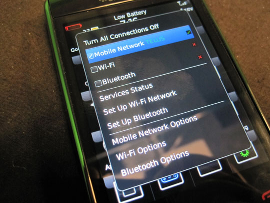
Along with Telus Rev A EVDO CDMA wireless connection the Storm 2 now has Wi-Fi, and there is not much to say other than this was a much requested feature missing from the first Storm, which works very well, and with the high cost of data in Canada, being able to use wireless hotspots is a bonus.
Battery:
The Storm 2 has a 1400 mAh battery which is rated for 11.2 days to standby and 5 hours of talk time, which is comparable to the other major touch screen competition. After a day of fairly heavy usage (web surfing, twitter, calls, videos, downloads) the phone needed charging after about 12hrs. While this seemed pretty good to me, for a phone with a large touchscreen, this certainly does come close to the battery life of other Blackberries, like the latest Bold 9700. However I am quite comfortable with hooking it up to the charger every night, but if you go on a trip don’t forget to pack it!
Camera:
The Storm 2 has a 3.2 megapixel camera with a flash, which is an average resolution compared to its competition. It takes stills, records 480 x 360 video, and has auto-focus and image stabilization. The flash is very bright, which does come in handy for low light video and stills, but the image quality is only average at best.
Call quality
One area that RIM has never compromised on is call quality and reception. Running on Telus’ rock solid CDMA network the Storm 2 was a stellar performer. The volume was excellent with crisp clear sound, and the speaker phone was very loud.
OS and Applications
The Storm 2 is one of the first Blackberries (along with the 9700) to use RIM’s new OS 5, however if you didn’t know any better you’d be hard pressed to see any differences between OS 5 and 4.7, which was on the first Storm. This incremental approach to upgrading their OS is, in my opinion, RIM’s Achilles heel when it comes to competing with the iPhone, and Android phones like the Motorola Milestone (Droid) and Nexus 1, because building a super secure OS for the Enterprise means so a lot of energy has to go into features that the average non-corporate user will ever see. From a familiarity stand point, both from the end-users perspective, and IT support staff’s at a large corporation, it is important not to change the basics, but both the Storm and Storm 2 are large touch screen phones running a OS that clearly was never originally designed to be used with a touch screen.
According to RIM the new OS added specific touchscreen enhancements for the Storm and Storm 2, like inertial scrolling, some improved minor interface tweaks, and better typing accuracy. For all other supported phones there is an improved browser, and threaded SMS. All the other improvements are email and messaging related – however they are available only if you have your corporate email on Blackberry Enterprise Server 5. Those improvements include follow-up flags for e-mail messages; e-mail folder management, and the ability to view, edit, save, or e-mail documents from remote file shares.
So for those who have not used Blackberry OS before on a touch screen how does it compare to the competition? The home screen and main menu has large finger friendly icons, that work very well with the SurePress screen, and the OS is smooth and snappy – the capacitive screen and scrolling mean navigation in core apps like messaging, email and web-browsing is very good. All the core applications that were re-designed for touch screen use, such as the media player, work very well, and look great on the Storms 2’s large screen. However as soon as you have to dive deeper into the options and menus the small buttons, and text boxes designed to work on a phone with an optical touchpad, are hard to use, so much so that I wish the Storm 2 also had a touch pad. Like Android, Palm OS and Windows Mobile, Blackberry OS has a distinct advantage over the iPhone OS by supporting true multi-tasking – hold down the menu key and you can see which apps are running and switch to it be clicking on the apps icon. Also one of RIM’s core strengths, found in all their phones, – is that Blackberry OS is incredibly reliable and secure. A business device that many companies depend on 24×7 can’t freeze or crash in the middle of an important task, and as businesses interact with sensitive corporate data, everything is encrypted, and can be managed by an IT department remotely (It is this high level of security though that prevents applications from being installed on the memory card).
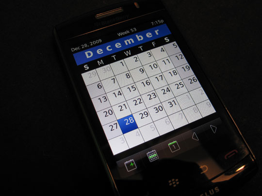
The other native apps such as messaging, through SMS or Blackberry Messenger, work very well, especially the new Blackberry Messenger 5 (a comprehensive review can be found here). Email of course is a stand out, and this is to be expect, considering the Storm 2 heritage – if you are using any kind of corporate (Blackberry Enterprise email, BES) email, or Blackberry Internet Services (BIS) email, the Storm 2 is one of the best email devices on the market – the always on instantaneous email delivery, that doesn’t kill your battery, is one feature that none of the other major smart phones can match. The large screen makes reading longer emails a joy, and the much improved on screen keyboard, with a little practice, is almost as good as a physical keyboard.
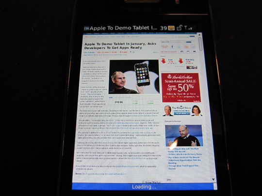
Sadly the included web browser is only average – at first glance it looks good – the large screen of the Storm 2 allows pages to be rendered fairly accurately when zoomed out, and the compressed nature of the data coming from RIM’s server mean that the pages load reasonably fast. However, in comparison to the competition on Android and the iPhone, the Blackberry browser is still lacking many core features, such as tabbed browsing, multi touch zoom and Flash support (which admittedly is not on the iPhone or Android yet either, but will be on Android soon), and while for light surfing the browser is adequate, there are times that the browser actually refuses to open some complex pages. Thankfully RIM has recognized their browser’s short comings and recently bought mobile developer Torch Mobile to work on a Webkit based browser (Mobile Safari on the iPhone is Webkit based) for BlackBerrys. Hopefully the new browser will come soon that later, because as it stands the browser is currently one of the weakest parts of Blackberry OS 5.
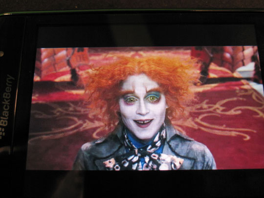
The native Blackberry media player supports a good selection of video file formats, and the included desktop ‘Media Sync’ software will also convert any videos before they are synced to the Storm 2. The video formats supported are:
• MPEG4 H.263, MPEG4 Part 2, Simple Profile, H.264, WMV
Video playback is smooth and looks very nice on the large screen. Combine this with the Storm 2’s loud speaker, good headphones, and a big micro SD card, and the Storm 2 becomes a very good portable movie player.
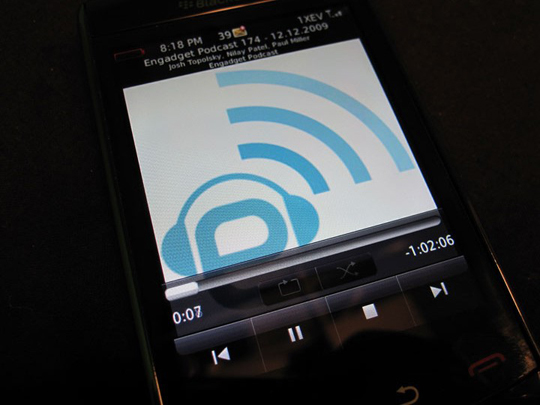
For music the audio file formats supported are:
• MP3, AAC, AAC+, eAAC+, WMA, WMA Pro Plus
As you can see the Apple/iTunes AAC format is natively supported, and the desktop ‘Media Sync’ software can connect to iTunes and sync your music, and playlists, onto the Storm 2 – again with a big memory card, and good headphones (like the ones included with the phone), the Storm 2 is a viable replacement for your iPod.
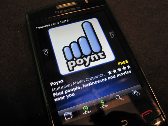
Lastly no modern smart phone would be complete with a full complement of downloadable applications. In this area the iPhone is definitely king, with over 48,000 apps available, and Android is catching up fast. RIM however was late to the game with their own on device App store, Blackberry App World, and while the argument can be made about quality over quantity, it has only 5000 apps, which is nothing to sneeze at, but means less choice for the user. Luckily many developers are coming on board and bringing out new apps all the time, since they realize that RIM has such a huge market share of smart phones, and a of lot favourites like Yelp, Shazam, Slacker radio are there – and, unlike Android, paid applications are available for Canadians to buy. One catch with the Storm 2 is that in order for the app to take advantage of the large touch screen, and OS 5, it has to be updated by the developer. While many of the ‘big name’ apps are work great on the Storm 2 (such as UberTwitter, an excellent twitter client for Blackberry OS) some older apps have a difficult time with the touch screen, so always download a trial version first to test out compatibility with the Storm 2. As far as handheld gaming goes the Storm’s memory limitations, and business focus, mean that while there are over 1000 games available in App World, don’t expect it to replace the iPhone as the gaming smart phone to beat. Overall the apps that are available, and that are OS 5/Storm 2 ready, are good quality, and comparable to those on any other smartphone platform.
Conclusion
So after a week with the Storm 2 what is the final Verdict? I went into this review with a lot of scepticism, and at first the initial learning curve, especially the SurePress screen, almost proved my scepticism right. All of the negative feedback about the Storm made me predisposed to NOT like the phone, and I was pleasantly surprised when I got past the learning curve and found a very good smart phone underneath. SurePress 2 works as advertised and I have to commend RIM for trying to do something different with a large touch screen. The build quality is top-notch and all the hardware is almost perfect, from the buttons to the audio quality, just let down a bit by the lacklustre camera.
It was only after a spending a little more time with the phone did I begin to see a few chinks in its armour, and it all revolves around the OS. Blackberry OS 5 is certainly the best OS RIM has ever made, but it is an incremental upgrade. As a messaging device, be it email or SMS, the Storm 2 can’t be beat, but the OS is really holding the phone back from reaching it’s true potential – the web browsing experience is only average and there are not too many applications available optimized for the Storm’s large touch screen.
There is hope though that Blackberry OS 6, which will probably be available as an update for the Storm 2, will truly tap into the phones true potential. Until then I would have to say that if you are in the market for a high-end smartphone there are better options available to you, but if you are a RIM fan it’s certainly the best Blackberry on the market – if your work requires you to use a Blackberry, or if you own an older Blackberry and want to upgrade and stay with RIM, then the Storm 2 is the phone to get.
The Storm 2 is available on Telus for $199.99 on a 3 year term, $599.99 without a contract.


[…] View original post here: Telus BlackBerry Storm 2 Review […]
My Telecoms Touch Phone Reviews…
Great site. Take a look at out top 10 touch phones of 2009 if you get chance!…
[…] operating system. RIM also eliminated the SurePress screen technology found on the Storm and the Storm 2 and are now rolling with a capacitive touchscreen without the clicking […]