Bell Motorola DEXT review
 At the height of the RAZR’s success, Motorola was a force to be reckoned with in the mobile space, but the migration to an increasingly smartphone world has left Motorola behind. To make make a push back into the phone market, they’ve decided to hitch their wagon to Google’s Android train, with the announcement of the qwerty keyboard packing CLIQ in the US last fall. To appeal to social networking aficionados, the CLIQ and it’s brethren are adorned with Motorola’s custom UI called MOTOBLUR, which provides a constant feed of Twitter, Facebook and other feeds.
For some inexplicable reason, Motorola decided to rebrand the CLIQ as the DEXT beyond US borders. Here in Canada, Bell recently launched the DEXT, and we had a chance to put it through it’s paces.
Out Of The Box
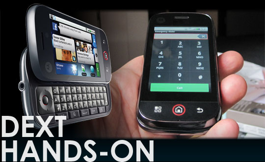
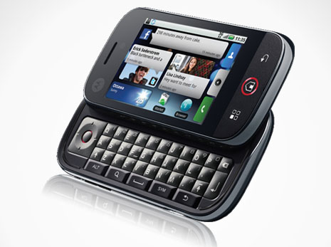
Motorola has generally been known for solid design choices, and with few exceptions, the DEXT lives up to that standard. On taking the phone out of the box, you’re first struck by the bulk of it. Although not a brick by any stretch of the imagination, it has a durable weight, and for a landscape qwerty slider, Motorola has managed to keep the thickness down. The durability of the build translates to the keyboard slider, snaps into place with little to no give. The DEXT feels like it can take some abuse without failing.
On the front face, Motorola went with flush capacitive buttons for the Menu, Home and Back buttons, which adds to the visual appeal, without sacrificing much functionality. I almost always prefer physical Call/End buttons, but this is more of a hangover from the early days of smartphones than anything else.
Physical buttons located around the edge of the DEXT include volume rocker, camera and standby buttons which all work well for the most part. The camera button is an odd bird though, as it has the same two-stage press as many point-n-shoot still cameras. Hold down to the first click and the auto-focus will kick in, and press all the way in to snap the picture. Though the mechanism works, when pressing to take a picture, it felt uncomfortably deep, as if I were going to bury the button inside the body.
The DEXT also sports a standard 3.5mm jack on the top, which is a good thing, as the days of proprietary audio jacks on mobile devices is coming to an end. Also in the Hooray-For-Standards department is a Micro USB port for charging and syncing.
The Keyboard
When looking at a landscape qwerty phone, you’re obviously interested in fast text entry. On that front the DEXT offers a mixed bag. On one hand, the keyboard has nicely domed buttons that are reminiscent of the old HTC Wizard, as was the responsiveness of the keys themselves. This is a good thing, as I loved the keyboard on the Wizard, and Motorola knocked it out of the park… mostly.
You see, they also decided that although Android is designed for touchscreen goodness, they should put a physical d-pad to the left side of the keyboard. It’s not the first time a manufacturer has done this – in fact it seems to be a particular plague amongst Android phones – but I certainly wish it was the last. I just don’t comprehend this decision. It creates an offset in holding the phone when typing that’s quite irritating and although I eventually got used to it, I couldn’t help but think that the DEXT would have been better served with a full width keyboard. It’s just as easy, if not easier, to shift a thumb up to the screen itself for faster navigation than manipulating a d-pad to get around. Sure, it MIGHT come in handy with some games, but beyond that, it probably won’t get used by the vast majority of DEXT users.
Don’t get me wrong. This is probably the best Android keyboard device I’ve used. It easily trumps the G1 and Milestone keyboards. It just that it could have been well-nigh perfect without the d-pad.
Under The Hood
The Motorola DEXT, like it’s siblings the Quench and the Backflip, is powered by a Qualcomm 528MHz processor, and has 256MB of memory available. Bell also includes a 2GB MicroSD card, but I’d highly recommend putting something with higher capacity in there right away, especially if you plan on loading it with music. The 5 Mpixel auto-focus provides decent pictures, but for those candid night club shots, you’ll want to have your point-n-shoot on hand.
All of this is used to run Android 1.5, which is a real shame. Although Google recently called Android fragmentation a red herring, there’s no getting around the fact that some applications and features are not available on such an old version of Android. It’s also very poorly optimized for performance compared to 2.1 (and even more so compared to 2.2, though I haven’t used 2.2 yet). Even though the MOTOBLUR service aggregates all your data and delivers it more efficiently than checking individual sources, the 1390mAh battery wasn’t enough to get me through a day of normal use. It would usually die on me by the end of the work day. Of course, with a USB cable I could top it off while at work, but don’t expect the DEXT to get you through a whole day out on the town without some way to charge it.
The call quality of the DEXT is solid, though the signal strength is far from best in class. One of the regular tests I put phones through is the ‘elevator’ test, where I move from my balcony to the elevator in the centre of the cylinderical concrete tube that is my building. Only one phone I’ve used has made it all the way to the elevator and maintained a call. The DEXT usually died on me around the time I hit the call button. It’s not bad, but far from best in class as well.
User Experience
The main interface with a smartphone is generally the touchscreen. In the case of the DEXT, it’s a capacitive 3.1 inch 320×480 display, which is fairly crisp and holds up well in most lighting conditions other than direct sunlight. Colour saturation seemed better than average as well. In using it to scroll around, it seemed responsive most of the time, and any lag was clearly software related.
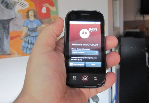
If Motorola were just banking on Android, then the Android 1.5 core could be seen a real problem, but Android is only part of the story. The ‘special sauce’ for the DEXT is the MOTOBLUR UI and the servers that feed it. When you first power up the DEXT, the first thing you do is create a MOTOBLUR account. After that’s done, you feed the phone your Gmail, Facebook and Twitter accounts. In fact, it supports a wide variety of services. Besides the 3 most widely known ones, it’s also includes MySpace, Picasa, Yahoo, Photobucket and 3rd party email accounts via Exchange, POP and IMAP.
Then the syncing begins, and there’s a lot of it. It could be argued that there’s too much syncing going on, as all your contacts from across your social network sites are dumped into one big contact list. Although you can create custom filters, as well as sort them by source, these options aren’t readily apparent. Though an interesting idea from a social networking point of view, if you actually use your phone as a phone, and aren’t aware of the filtering options, you’re going to find your contact list downright frustrating.
After this initial setup, and you get to the BLUR homescreen, you’re ready to go. The essential interface of BLUR is a series of widgets that populate the Android home screen. The first of these is the Status widget which shows you your most recent update, and gives you an easy and quick way to do updates, and choose where you want those updates to be sent. For example, you can send an update just to Twitter, or to all your networks at once. This can be quite useful, but for people who are already plugged into a number of networks, they’re probably already using a single service, like Twitter, to feed everything else. Messages is the next widget, which aggregates messages sent directly to you, though the v
Happenings is basically the ‘catch all’, letting you know what’s going on in general, but it has a major flaw. Each update is preseneted on it’s own page, which means you have to scroll through individual posts. When the most frequently updated information is probably coming from Twitter, which is limited to 140 characters, this is, quite frankly, a huge waste of screen real estate and time. You can click through and get a more standard scrollable list, but that makes Happenings kind of redundant, as you’d be better off with dedicated applications that provide deeper functionality.
I was honestly underwhelmed by the whole MOTOBLUR experience in general, as it felt as though Motorola was trying to throw the social networking kitchen sink at their UI. There are good parts to it, but no part that is so compelling that it can’t be replaced by a better dedicated application. Even if you disable the BLUR widgets to roll with a more standard Android experience, the phone often felt sluggish. Like many under-spec’ed Android phones, Advanced Task Killer, is a must have first install.
The BLUR experience isn’t something I’m looking for in a phone, but Motorola has made a Flash demo available online if you want to give it a whirl. You can check it out here.
Not all smartphones are created equal, and they’re not meant to be. The DEXT is clearly focused on the text-happy social networking set. After all, if you’re drawn to this phone, you’re not the kind of person who necessarily cares how many applications are available in the Android Marketplace. You just want to stay up to date on friends and feeds, and texting with a real qwerty keyboard is part of that equation. For those purposes, the DEXT is certainly a viable, if quirky, option.
For anyone considering an Android phone for general use, who’s less ‘into’ the social networking features, you probably want to look elsewhere. Although disabling the BLUR widgets certainly helps in performance, the 528MHz processor in combination with what is, let’s face it, an ancient version of Android, is just going to be a poor experience.
I can’t help but think that having the DEXT roll out 6 months later in Canada really does hurt it as well. There’s nothing inherently wrong with the phone, but unless Motorola upgrades the phone to 2.1, or 2.2, it will probably have a short life. You’ll hit that Android fragmentation problem sooner or later. And that’s not a problem you want to run into less than a year into a 3 year contract.
UPDATE: It should be noted that although there’ s no official upgrade to Android 2.1 announced for the Canadian DEXT, according to the Motorola Owner’s Forum, the CLIQ will be getting Android 2.1 sometime this quarter, and DEXT upgrades have either been announced for various regions later this year or under evaluation. This may make a difference in the performance of the phone. If we get a chance to compare it, we’ll definitely update this article further.
The DEXT is available from Bell at $79.95 on a 3 year contract.


[…] This post was mentioned on Twitter by Doug Groves, rgbFilter. rgbFilter said: Bell Motorola DEXT review: At the height of the RAZR’s success, Motorola was a force to be reckoned with in the mo… http://bit.ly/cL9u1f […]
[…] are only minor at best. 99% of what has to be said about these two phones can be found in the review of the DEXT as performance wise they’re […]
[…] but it did look to be a big improvement over the first generation of Motoblur found on the Quench, Dext and Backflip. One disappointment was the resolution of the screen, which was very low and pixely, […]
We hope that you find this information useful and look forward to assisting you in the future. Thank for this support.
I’m not sure why but this blog is loading extremely slow for me. Is anyone else having this issue or is it a problem on my end? I’ll check back later and see if the problem still exists.|
I could not refrain from commenting. Exceptionally well written!
Its not my first time to pay a quick visit this web site, i am browsing this website dailly and
take nice information from here all the time.
Someone necessarily lend a hand to make critically articles I might state.
That is the very first time I frequented your website page and up to
now? I amazed with the analysis you made to make this
actual publish incredible. Excellent process!
This is really attention-grabbing, You’re an overly professional blogger.
I have joined your feed and sit up for searching for more of your wonderful post.
Additionally, I have shared your website in my social networks