Motorola BACKFLIP on Telus & QUENCH on Rogers
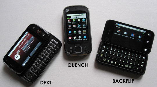 Unlike a good scotch, phone operating systems don’t age well, so writing a review for smartphones running Android 1.5 is a tough sell. This problem is exasperated when said phones are from the same manufacturer, have the same internals, same UI and same overall performance.
That’s exactly the predicament in trying to discuss the Android based Backflip on Telus and Quench on Rogers. You see, I reviewed the Dext from Bell last month, and from a performance standpoint, they’re the same. The only real difference to an end user is the form factor, and even then the differences are only minor at best. 99% of what has to be said about these two phones can be found in the review of the Dext as performance wise they’re identical.
The Hardware – Quench
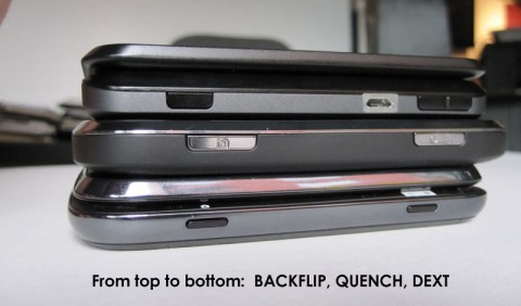
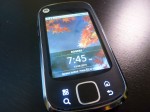
Out of the BLUR trio, the Quench is the only one that doesn’t have a physical keyboard. This makes it more svelte and pocketable than its brethren, though a slightly larger footprint due to a track pad at the bottom of the screen, surrounded by four buttons for Home, Menu, Search and Back. Like the other BLUR phones, the Quench is a solid feeling piece of hardware, and on this front Motorola has done a good job.
The Hardware – Backflip
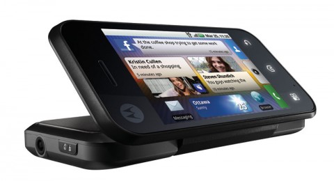
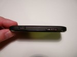
The Backflip, like the Dext, has a landscape QWERTY keyboard, but instead of the typical slider format, the keyboard uses a reverse hinge to flip out from the back. When closed, the keyboard is exposed on the back of the phone, though it feels relatively safe when set on a table, as it’s slightly inset from the edge of the device. When flipped into typing mode, the back of the screen portion, where your index fingers sit, actually have what’s called the “Backtrack”, which is a track pad for navigating the screen while keeping both thumbs on the keyboard. In practice, I found little use for it, even though I really tried to like it. I don’t hate it, and it didn’t interfere with typing, so it becomes a take it or leave it proposition.
The keyboard itself is a different story. The travel and overall feel of typing on the Backflip is a mixed bag at best. Due to the exposed design, instead of physically distinct keys, it’s a fairly mushy feeling overlay keyboard, which I personally can’t stand. At the same time, the layout of the keyboard is excellent, so the end result is that I had no problems getting to the keys that I wanted, but I never felt confident with the soft little clicky feedback they provided.
If Motorola is considering refreshing this line of phones in the future, the keyboards from the Dext and Backflip should get married and have a baby. If that baby has the layout of the Backflip, and the physical keys of the Dext, it can only be better. If they’re thinking about the keyboard of the HTC Touch Pro 2 while consummating this marriage, well there’s no harm in that either.
User Experience – See the Dext review
Each carrier has their own value add services attached, but beyond that, the experience is the same. The Rogers Quench does include the SocialView service, so you can use the Facebook, Twitter and other built in BLUR apps with unlimited data. The down side is that this doesn’t apply to 3rd party applications downloaded from the Android Market. The Quench can also run Rogers new Rogers On Demand Mobile application that was showing the Fifa World Cup games live, and now shows video clips from select channels. More information about SocialView on the Quench can be found here.
While I didn’t get a chance to test the Backflip, I did get to spend some time with Quench. Unlike Doug I actually found the Quench to be one of the best ‘entry-level’ Android based phones currently available. Yes it does run 1.5, and yes it does have the much maligned MOTOBLUR interface on top, but overall there are worse choices you could make.
The Quench is a well-made phone, a lot better than some of the other cheap Android phones, such as the Galaxy Spica and HTC Magic. The phone feels solid, fits nicely in the hand, and has a nice textured soft-touch finish on the back, which helps you grip the phone. The screen, while low resolution, is nice and bright, and seems to be glass, unlike the plastic used on some other entry-level Androids. MOTOBLUR does have some good points – the unified Twitter app, because I guess the tweets have to be stored on the Motorola server in the cloud, stores days’ worth of Tweets, rather than the 250 that the Twitter API limits other apps to. It also continuously backs up you data to Motorola’s servers, so if you lose your phone you can easily wipe the device, and restore the same data to a new phone. I also liked the software keyboard, which had a nice layout, and great haptic feedback.
However I do agree with Doug that the Quench still has major short comings, and being stuck at Android 1.5 is the biggest one – you need at least Android 1.6 to use newer apps, such as Google Maps Navigation, which was just released in Canada. This also means that the web-browser is the ‘old’ Android one, which frankly sucks – zooming is terrible, no pinch to zoom etc. MOTOBLUR is still sometimes a cluttered mess, and is missing many basic features one expects, such as being able to re-tweet in the twitter app – most third-party apps can do everything that MOTOBLUR does, better, just not in a ‘unified’ way.
The silver lining to this cloud, though, is that Motorola has promised an upgrade to Android 2.1 – which was supposed to come out at the end of June for the US version of the Quench (the T-Mobile CLIQ XT) – but has been pushed back to August. Early looks at the soon to be released FLIPOUT, running the enhanced MOTOBLUR on Android 2.1, show that there is still promise in MOTOBLUR. Hopefully Motorola will see fit to bring this update to Canada too, because with it the Quench could be a contender for the entry-level Android phone belt.
Final Thoughts
Like the DEXT, both the Backflip and the Quench suffer from a case of “too little – too late” for me to recommend to anyone interested in a smartphone that has a lot of flexibility. The BLUR interface tries, but it bogs down the phones to the point where they’re frustrating to use. Even with upgrades to Android 2.1, the slower processors and 320 x 480 screens are fairly limiting. It’s clear though that this isn’t the target Motorola is aiming at for these phones, and if your primary interest is in keeping tabs on the social networks that BLUR integrates with, then these phones will do just fine.
Since the real cost of a smartphone is in the monthly fees, balking at a minor difference in the up-front costs would seem almost petty. Ultimately, if you’re looking for an Android phone, all 3 of the carriers have phones with more horsepower at similar costs, and given the rapid pace of Android development, that horsepower will come in handy down the line.
Rogers Quench – starting at $49.95 on a 3 year contract. It qualifies for Rogers ‘Social View’ data plans. It is also one of the supported phones for the Rogers On Demand Mobile application.
Telus Backflip – starting at $79.95 on a 3 year contract.








[…] This post was mentioned on Twitter by Doug Groves. Doug Groves said: Motorola BACKFLIP on Telus & QUENCH on Rogers http://dlvr.it/2Wr52 […]
[…] limited, but it did look to be a big improvement over the first generation of Motoblur found on the Quench, Dext and Backflip. One disappointment was the resolution of the screen, which was very low and […]