Xbox Dashboard Fall Update 2010 – Netflix in Canada on the 360
The Xbox Dashboard getting a fall update is about as dependable as the leaves changing colour and pumpkins popping up at every corner store. If you’ve already signed up for the preview program (now closed), you should have it now. Though we Canadians don’t get all the goodness of our US brethren (no ESPN and no Zune Pass), the update does support Canadian Netflix access, and gives the user an idea where Microsoft is headed, not just with the Xbox, but with it’s interface metaphor across a wide swath of services for the next few years.
The overall impression of the new Dashboard is that it’s a cleaner interface. It still has visual flair, but it’s not as busy as the the last iteration. The vertical list of items is now much more in line with the Zune and Windows Phone 7 aesthetic, which is a welcome change. The horizontal scroll similarly uses the same ‘bleeding off the edge of the screen’ when there are more than three panels to choose from. The Xbox Dashboard has always been well-presented, and each iteration introduces more polish.
One of the main goals behind this update is to provide the interface support for Kinect, but since that particular device doesn’t come out until November 4th here in North America, there’s not too much to say. We did get a chance to see the beta version of the Kinect Dashboard in person at Microsoft X’10 last month…
We also got a sneak peak at the Kinect friendly version of the Xbox Dashboard, which allows you to navigate the console with either gestures or voice commands. Both features were working spot on, and it seems that Microsoft’s goal of making Kinect an additive experience for the Xbox, has really paid off. One quick note is that the voice controls aren’t bilingual yet, but they are working on it.
Beyond the Dashboard, most applications have been updated as well. The Zune interface gets a refresh, but as I mentioned before, still no Zune Music love so far (note: at one point I DID see the music option, but it mysteriously disappeared). Also, for those who are into customizing their Avatars, you’ll find a much easier to navigate interface, with your digital self smack dab in the middle of the screen, and a series of floating icons of change surrounding you.
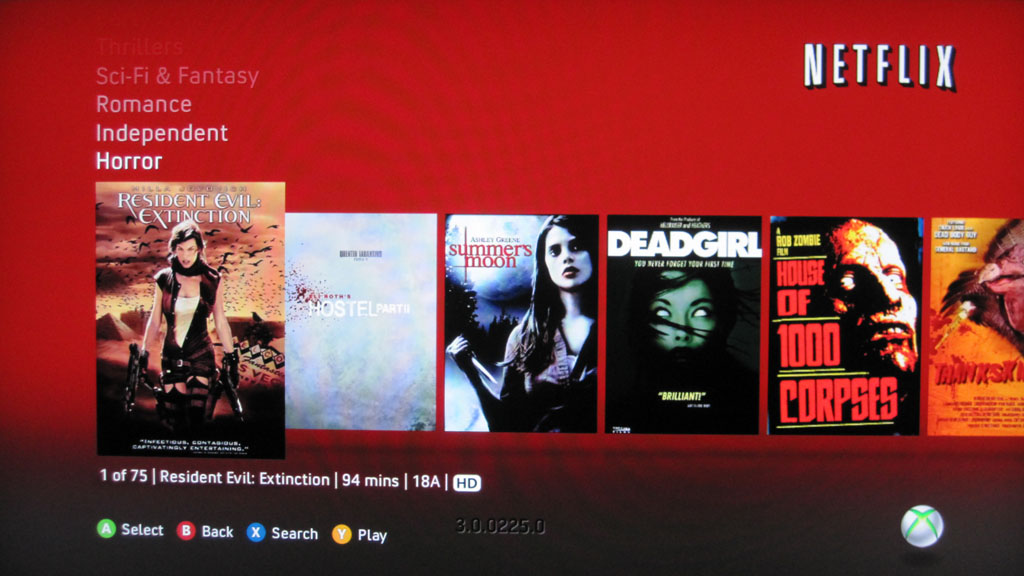
Netflix is also enabled for Canadian users, complete with the Netflix saturated red everywhere. The interface certainly takes it’s cues from the Xbox Dashboard, and I have to admit that I’ll probably be spending a lot of time in this particular part of the 360 going forward. When Netflix already knows to recommend “Pi”, “Shaun of the Dead”, “House of 1000 Corpses” AND “Deadgirl” within the first week, kudos… take my money please.
As a whole, it’s a solid update, and everything appears to be snappy. It’s funny, but after running though the preview of the interface, I realized that it’s been a while since I actually missed the original ‘Blades’ interface.
UPDATE – How to get Netflix Canada on your Xbox 360:
If you signed up for the fall Dashboard preview, simply navigate to the “Video Marketplace” and launch the Netflix viewer.
There’s a one time authorization that needs to take place. When you do you’ll be given a 6 digit pin. Stay on that screen.
Go to netflix.ca/activate on… your computer, and enter that pin.
In a few seconds, the console will be approved, and you can start watching.
The 360 interface is pretty good, and follows the basic design aesthetic of the rest of the Dashboard.


[…] This post was mentioned on Twitter by Doug Groves, rgbFilter. rgbFilter said: Xbox Dashboard Fall Update 2010 – Netflix in Canada on the 360: The Xbox Dashboard getting a fall update is about … http://bit.ly/c0e8B9 […]