Sony Vaio P review
Sony first launched the subnotebook sized Vaio P line of computers back in early 2009, during the heyday of the netbook. At that time they sold the line as a ‘lifestyle PC’, and not to competitive to netbooks, though many of the internal components were similar to netbooks. Price was certainly one differentiator between the Vaio P and it’s component cousins, as the 1.33 GHz Vaio started at $900 US.
Since that initial launch, Sony has made some much welcome tweaks, including a very handy touchpad and a faster CPU under the hood, not to mention an accelerometer to automate screen rotation. The real question is whether these changes justify the price tag.
Out Of The Box
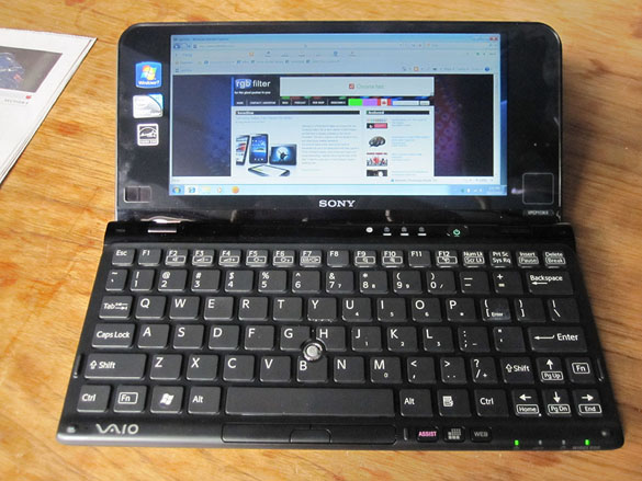
The Vaio P is a looker, there’s no questioning that. Clocking in at about 3/4″ thick, and with a more modern styling, it’s svelte, attractive machine. They’ve also went from the standard glossy plastic look to a matte finish, and offer it in five diferent colours. Besides the all black model (which we reviewed), it’s also available in white, green, pink and orange. The bezel around the screen and the ports on the side maintain the black colouring, and in person the vibrant models look very sharp. There’s something about neon green that just works for me, and with the black details it’ll certainly turn heads, if the form factor doesn’t.
Usability
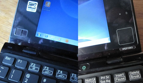
When you open it up, you’re greeted with a VERY wide 1600 x 768, 8″ display, with extra wide bezels on the left and right. In the first generation Vaio P models, this really was wasted space. Sony has done something unique here though, and turned that space into navigation. On the right bezel is a touchpad, and on the left are small left/right mouse buttons. If you’re merely surfing, and not doing any typing at all, it’s feasible navigate while keeping your hands comfortably cradling the hinge.
When you need to do more, the keyboard itself is okay, but that’s about it. I didn’t do any full measurements, but the keyboard clocks in at about 90% full size, or about the same as a 9″ netbook such as the Acer Aspire One, which less vertical distance between key rows. It’ll work, but it’s not best in class. You’ll also find a ‘nub’ track pointer for the cursor above the ‘B’ key, which works just fine, although I found the texture of the nub a little too gritty. Another issue I encountered was that it’s almost impossible to find a truly comfortable typing position outside of setting the Vaio P on a flat surface. The shallow resting surface and small overall size made it difficult to use in a lap.
The keyboard isn’t the only thing that is too small. The screen makes for very awkward use as well. With a massive resolution on a small display, not only is it easy to lose track of the cursor, you end up either squinting all the time, or hunched over the Vaio P to get in close. They do have a quick switch to swap the resolution to 1280 x 600, it means much more scrolling around. I never felt truly comfortable using it for any period of time, and would be surprised if anyone did.
Power and Performance
I hate to use the netbook term again, as Sony doesn’t like the comparison, but you can expect about the same performance. It’s decent enough for light web surfing and some document editing, but not much more. With it’s dimunitive size, I can see it working well for the “on the go writer”, especially if you can get used to the keyboard. Although the Atom processor is fairly power efficient, that whole size issue means you can’t expect much juice. With WiFi on, I rarely got past the 3hr mark. Once you start doing video, you can expect a faster drain, but video is probably not going to be one of your concerns, with the Intel GMA 500 on board. Although it handled HD Youtube content well (as long as I stuck to 720p), local HD content is far beyond the reasch of the GMA 500.
In the end, what the Vaio P needs
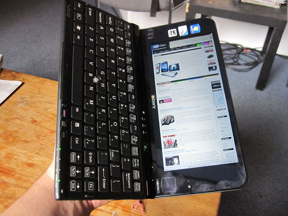
A touch screen, and in a bad way. Remember that accelerometer I mentioned earlier? Once I flipped the Vaio P onto it’s side, the unusually wide screen becomes an unusually long screen. I tried both the Kindle for PC software and some comic reading software and actually loved the weight and feel of the Vaio P on it’s side. The frustrations of using it laptop style would be largely mitigated by putting a touchscreen on it.
Sony has certainly done some interesting things to the Vaio P, and the latest iteration is a far superior machine in design. The form factor is compelling, and it’s clear there’s a lot of engineering know-how put into a tiny package. In the end, there’s no way that the Vaio P can avoid being mentioned without the words overpriced and underpowered for the vast majority of consumers. It’s really a niche computer for somebody who wants something that has (lots of) style over netbook substance, and doesn’t mind paying the stiff minimum of $900 to jump in. A touch screen and better battery life would go a long way to making that price a easier to justify.


[…] This post was mentioned on Twitter by Doug Groves, rgbFilter. rgbFilter said: Sony Vaio P review: Sony first launched the subnotebook sized Vaio P line of computers back in early 2009, durin… http://bit.ly/c1uWqw […]