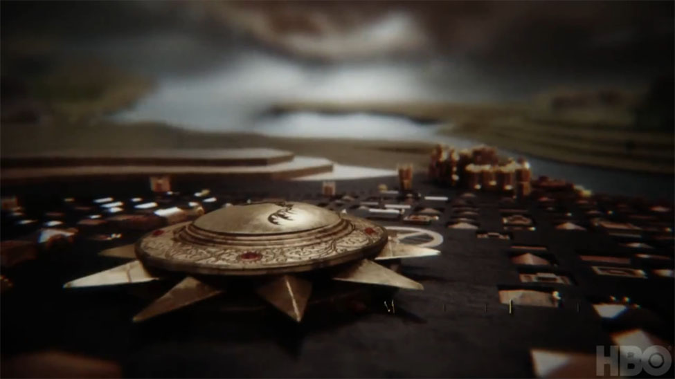
Game Of Thrones title sequence design
If you haven’t already seen the HBO series Game Of Thrones, which airs in the US and Canada, I can’t highly recommend it enough. Based on George R. R. Martin’s fantasy series of novels, the setting is more medival earth in a lot of ways compared to most sword and sorcery fare. It also has an amazing title sequence which stands as a work of art in its own right. The sequence maps out the world of Westeros on the inside of a sphere, and taking its design cues from medival cartography for the landscape and clockwork mechanisms for the points of interest.
Our friend Will Perkins (also editor of Dork Shelf) & Ian Albinson over at The Art of the Title Sequence took the time to sit down with Angus Wall, creative director of Elastic about the process of putting the sequence together.
Art of the Title: So you’ve got the idea; you know that it’s going to be a Dyson type sphere and you know it’s going to light it. Where do you go from there?
Angus Wall: With the shape of the world determined, we started doing concept art, detailing what these places would look like given the fact that the world is round and they’re made of wood and stone and they’re of a certain size. We had several very talented concept artists working on this. At the same time we set up the world in previs and started blocking out the sequence. It seemed fruitless to do storyboards because they don’t move and in my mind this whole sequence had to be really dynamic. [from the interview]
It’s a great interview, and the piece is full of some great concept art as well. The official title sequence is linked below, but really, you should be watching the show. I’ve never read the books, and it’s great. It’s also getting great reviews from fans of the novels as well.


