It’s a bird, it’s a plane, it’s an interactive videobook
Interactive videos are hardly all the rage anymore, thanks to YouTube allowing anyone and everyone to clutter up the screen with a pastiche of semi-transparent boxes urging viewers to “CLICK TO SEE MORE VIDEOS”, whichh will in turn be cluttered with semi-transparent boxes. But every now and then, someone comes along and puts a new spin on the whole idea. BooneOakley, the little North Carolina ad agency you may have seen recently on AMC’s The Pitch, is the best example of doing it right I can think of without resorting to Google, and that’s at least 10 years old. The short version is, BooneOakley needed a website. In a time when YouTube was not yet a household name and ad agencies were saying to themselves “This Internet thing just might be taking off”, BooneOakley saw potential in YouTube’s built-in button feature and made the decision to have their entire website exist as a series of linked YouTube videos. And the kicker? It works. Check it out here for yourself. It’s just stupid-good stuff.
I’m sure there are tons of other examples one could cite, but that to me is the perfect trifecta of good site design: it’s innovative, it’s engaging, and it’s easy. In a world of “Fast, Good and Cheap: Pick Two”, it’s a refreshing reminder that the tools for innovation are sitting right in front of us at all times. So when I saw Jet Lag today for the first time, I had to tell the world about it in more detail than just hitting “like”. So excuse me while a gush a little.
Jet Lag is an interactive promo for the book of the same name by Jean-Marie Dru, Chairman of TBWA Worldwide, the ad agency that’s responsible for, among other things, Apple. Mr. Dru is worth knowing in ad circles because he’s of the increasingly rare mind that old media will not be replaced by new media, only complemented by it, and that TV ain’t goin’ nowhere anytime soon.
“The future of this business is the integration, the ability to create interaction between all the different media,” he said. “To do something on TV that resonates on the Internet and vice-versa, to do an event that will create a buzz on the Internet.”
And, Dru added, “integrating all these disciplines is a discipline in itself.” – New York Times
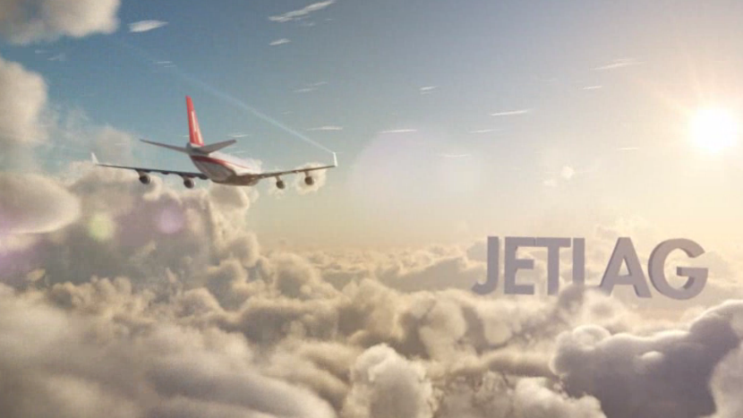
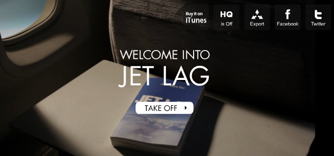
The site launches with a beautiful art-of-flight-inspired ride-along through the clouds, when suddenly you find yourself seated in Business Class, sipping a drinks and leafing through a copy of Dru’s book. The genius here is that the promo is divided into 26 chapters, and the user navigates them with the most obvious of input devices: their own keyboard. In each chapter, the book flips through the pages to arrive at the content, which is narrated in Dru’s own voice, while a slick animation plays out on the facing page to accent the content.
Again, in terms of promo and interactivity, this hits that trifecta that ad people should always be shooting for, while having the benefit of being not only uniquely about the product it’s promoting, but also pure and honest in its message. A book about building brands by a guy who’s travelled the world building brands, set in a traveller’s world while building its own brand? That’s cool. It’s also where a lot of us are likely going to read it, and, probably, where the thing was written in the first place.
You can download Jet Lag: An Ad Man’s Vision of the World from iTunes here.


Wow! This blog looks exactly like my old one! It’s on a completely different subject but
it has pretty much the same layout and design. Wonderful choice of
colors!
Your style is really unique in comparison to other folks I’ve read stuff from.
I appreciate you for posting when you’ve got the
opportunity, Guess I’ll just bookmark this web site.