iPhone 5: 5 days in
So Friday Sept 21 finally arrived, and with it, the latest iteration of the venerable iPhone. Me being the new-toy-nerd that I am, and one that is beginning to come to grips with what may be a severe case of Fanboyism, I dutifully ran down to my local Rogers store and waited in line with the masses to get my hands on the shiny gadget I’d wanted all my life…since 9 days prior.
Things were a little different this year, though. Instead of lining up at 2:AM and finding myself standing in the mid-20s, I arrived 10 minutes before the store opened and secured myself spot number 9. There was no great fanfare, there was no huge promotion, there was no time to wax nostalgic about our communal iLust with my fellow line mates; 10 minutes, the doors opened, and within 5 minutes I was seen to and a brand spankin’ new iPhone 5 was handed to me. It was almost surreal. Then, of course, Rogers’ system went down and it took over 2 hours to get the damn thing activated, and suddenly I felt right at home. So if nostalgia plays a factor in you phone upgrade habits, Rogers has you covered in that department.
Nevertheless, soon (ish) I was released back into the wild, holding in my hand a freshly activated iPhone 5 in black. My contacts and calendars were synced from iCloud before I could even hail a cab. My apps would be restored that evening from an iTunes backup, but beyond that, I was ready to roll. It was literally that easy.
Now it’s 5 days later, and the novelty refuses to wear off. But is it really the best iPhone ever, or is the lack of a huge teardown in terms of industrial design a disappointment?
Let’s take a look-see:
DESIGN
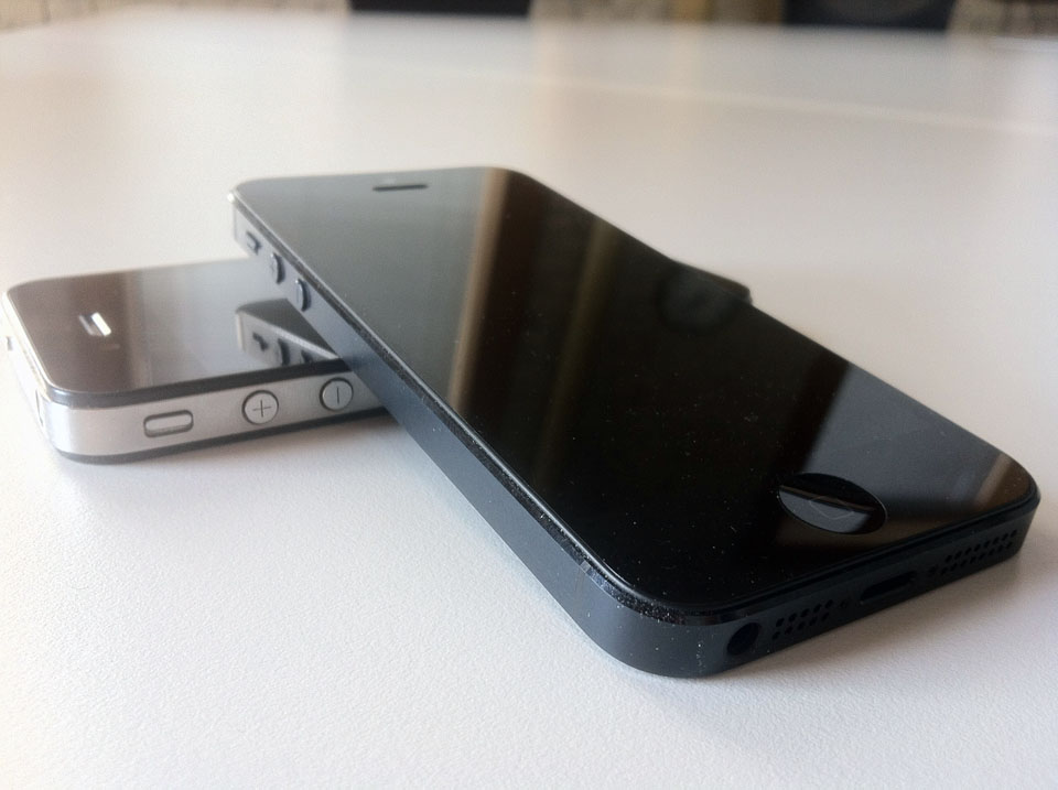
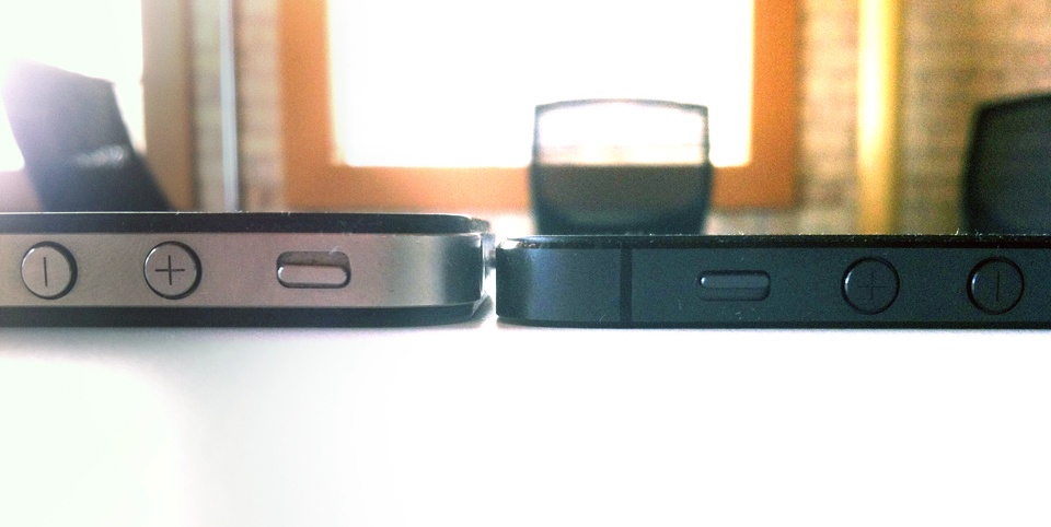
I’m gonna say it here, loud and clear for the cheap seats: The i5 design is a huge win. Here’s my rationale: Think of the i4. When that came out, everyone, and I mean EVERYONE, hailed it as the best designed phone ever. Even the haters. TechRadar described the detailing by saying “The edges are stainless steel, apparently forged by winged unicorns in an iceberg (or something) to be 10 times stronger than ‘normal’ steel.” Hyperbolic, clearly, but it made me laugh as I read on when they say “sleek is clearly still ‘in’ at the Cupertino HQ, and we can’t say we blame the designers when you look at the lines.” For my part, I have yet to meet anyone, even Fandroids, who doesn’t (or didn’t, at least) hold the phone and say at least “Wow that’s really slick”, before moving on to shred it down to the bone with harsh Pro-android sentiment. It is, simply, gorgeous. So why, when the i5 comes out as a natural evolution of the same design, is it suddenly scorned? “Apple can’t innovate” they say. “Steve would never have allowed this” they say, oblivious to the fact that this device has almost certainly been in R&D since far before Job’s passing. If the i4 was so close to perfect, how is the i5 so far?
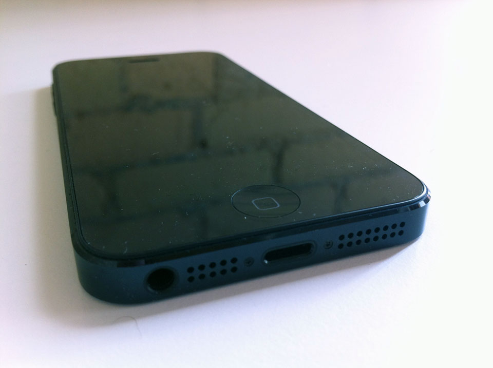
I’m here to say, it’s not. The screen is just the right size. The weight is so minimal you fear you’re gonna throw it across the room when you pick it up. The material is top-shelf. And the decisions make SENSE. The headphone jack is the ultimate example. Think about how you hold a phone. Does it make more sense to have to coil the headphone wire behind your hand, or let it hang loosly below? And how about just the simple action of putting it in your pocket? Now you just naturally reach for it topside-down…no more flipping the phone around in your hand, which I imagine will lead to fewer drops. The speaker is better. It’s made of some serious-abuse-taking material. This phone is the next logical evolutionary step for the best designed phone on the market. And it’s just gawddam beautiful.
iOS 6
OK, iOs, you’ve had your fun, but it’s about damn time you grew up. The extremely-familiar-to-ANYONE operating system has been a workhorse for the iPhone for 5 years and through 6 iterations now, and aside from some spit & polish, almost nothing has changed. It’s faster, it does more, but the same problems that have plagued iOS since day one persist. You can’t customize your springboard. There are no widgets. You have to dive into the Settings app to take care of what should be the simplest tasks, like turning WiFi on and off. Android has answers to all these issues, and has managed to evolve the OS into something mutatable and incredibly slick with Jellybean. And Windows Phone has arguably the most intuitive OS on the market, with everything a quick touch or swipe away.
By comparison, iOS feels dated and unpolished. IN fact the only UI feature they can still say is better than the other guys’ is Folders, though Metro has an interesting take on grouping apps with its At a Glance system. All in all, it’s time for iOS to evolve they way MacOS did. Sadly, MacOS waited until they got to version 10, and because Apple loves round numbers, I have a weird feeling that’ll be the case here too. Hopefully I’m wrong; that figure is predicated 100% on a feeling and nothing more.
So why do I stick with it?
Honestly, 4 reasons, only one of which is quantifiable. I’m familiar with it; there’s absolutely zero learning curve on a new Apple device. I like the features; Siri, for instance, is actually kind of great, and the new Maps app is gorgeous, even if it’s got more bugs than a basement Chinataown restaurant (To the naysayers, I say, shut up, it’s launch software; it’s bound to be buggy and we early adopters will just have to deal with it in the short term. Relax.)
The devices are beautiful; as much growing up as the OS has to do, the phone itself is just the sexiest thing on the market, bar none. And the fourth, the one and only quantifiable reason, is that I’m heavily invested in the Apple ecosystem. At home I have a mid-2012 iMac, a late-2011 Macbook Air, and an older Macbook Pro. At work I have a mid-2012 Macbook Pro. I have an Apple TV, 4 ipods, an iPad 2 and now 2 iPhones. And you know what? Every single one of those devices talks flawlessly to each other. I take a picture on my phone and it shows up on my iPad which is ported to iPhoto and then it shows up as a screensaver on my Apple TV. I schedule a meeting and it shows up in every calendar and my home computers, work computer, iPad and iPhone all remind me of it. It’s all seamless and slick and easy.
Yes, I can get this feature on other platforms, but I’m all Apple all the time at home and at work, and trying to get another phone OS to integrate as seamlessly is way more hassle than I’m willing to invest time and effort into. In short, my system just works. And to be fair, I still think iOS is a great OS…but its age is showing, and has been for a few years now. I’m reasonably sure the iOS team is cooking up something new for the future, but I’m also reasonably sure that that future is far enough away to make the less devoted among us take serious pause and reconsider their purchase decision when the iPhone 5S comes out next year.
LIGHTNING
Get over it. It’s a plug. Plugs get smaller. So you’ll either have to buy an adapter or all new docks. We’ve all had it pretty easy for like 8 years without a change. Even USB went through several rounds before it landed on Micro. Technology evolves. If I had ANY beef with lightning, it’s that I find it ludicrous that they would call it that and not make it compatible with Thunderbolt. But again, that’s coming. It has to be. Moving on.
THAT SCREEN
Other than the ageing OS, the one and only beef I have always had with the iPhone is the size of the screen. Sure, it was kind of huge when it launched, but it didn’t take long for the rest of the world to sit up and say “Hey…how bout we try bigger?” And the Battle of the Hugeness began. HTC said “Screw 3.5 inches…People want 3.8!!” And it snowballed from there, all the way up to the impressively huge and incredibly stupid-looking-when-you-use-it-as-a-phone Samsung Galaxy Note, sporting a 5.3″ display that basically doubles as a shield for your face if you don’t want people looking at you on the subway. The most popular Android phone on the market today, the Samsung 3GS GS3, rocks a slightly-less-massive-but-still-effing-huge 4.8 inch screen, and people are going nuts over it. Clearly, a lot of people want bigger screens on phones.
I was one of them until I held the i5. When it was announced, I was extremely disappointed when they made the screen only taller but not wider. I like a lot of real estate on my screens (I have 3 monitors at home side-by-side totalling 77″ in viewable space…I like to stretch my legs) and was really hoping for a 1280×720 resolution or better. But then I picked up the i5, and it occurred to me: this is a phone. It’s portable. It spends most of the day in my pocket. And accuse me of drinking the Kool-Aid all you want, but that rhetoric about your thumb being able to reach from one corner to the other ain’t bullshit; that’s how you use a freakin’ phone. (Well it’s how I do, anyway.)
Do I still want a bigger screen? Yes, partly…more real estate is a good thing, but if the iPhone ever does reach 1280×720, I hope they can improve the pixel density to the point that the display doesn’t get so big it fails the thumb test. The only other display I’ve played with that I may envy more is that of the Nokia 900, which at 4.3″ and 800×480 px might just be the sweet spot for phone displays everywhere (even if the resolution is a little low.)
FLAWS
Oh yeah, the iPhone has flaws. Two in particular. One of them is a bit of a surprise in that it’s a tech fail, and the other in that it’s one of the stupidest decisions I’ve ever seen applied to a mobile device.
First, the former: If you’re lucky enough to live in an area with LTE coverage, you’re probably enjoying lightning fast browsing speeds and snappy texting and emailing with your i5. If, however, you’re doing as I am and leaving LTE on all the time without switching to WiFi, you’ve probably watched your battery life just nosedive at an alarming rate. Apple claims the new i5 battery should get up to 8 hours of Web use on LTE, and I’m here to call bullshit on that. And blogs like this one agree with me. If I’m watching a video over LTE, especially if I’m also doing something else like sitting on hold, I can literally watch my battery meter plunge. My last full cycle charge saw me get somewhere in the neighbourhood of 3 hours of use and 8 hours of standby. That’s abysmal, and LTE is the culprit. Switching over to 3G sees significant improvement, but personally, I didn’t buy an LTE phone to use 3G all the time. It’s a feature I’m paying for. I want to use it. Fortunately I’m never far from a charging station, but that doesn’t excuse the problem. The iPhone 5 battery just sucks out of the box.
However, there are reports that people on older devices are seeing similar issues after updating to iOS 6. This smacks of the issues iOS 5 users had last year; reports of terrible battery life were rampant. An update from Apple was not far behind, and hopefully that’s the case again this time around. With conflicting reports of battery longevity, I’m on the verge of exchanging my phone in the hopes I just got a lemon.
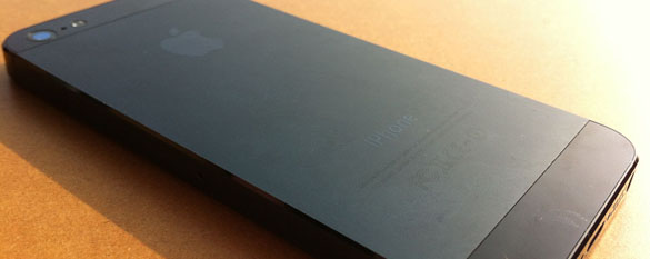
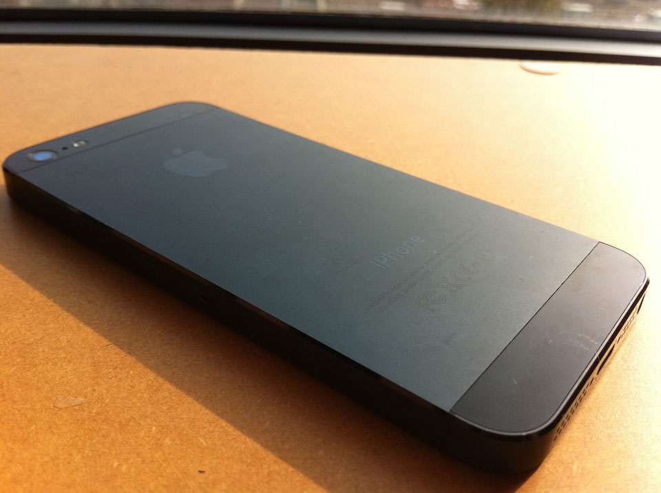
And now, the latter: The finish on the black iPhone 5’s body. Whoever had the bright idea to clad the black Iphone 5 in anodized aluminum deserves a punch in the back of the head. Yes, anodized aluminum, possibly the single greatest way to make sure that aluminum attracts every single chip, scratch and scuff it comes across in daily use. Hacking up aluminum with an anodized treatment is so freakin easy, even a baby can do it. This baby, right here:
To take a device that is going to be pulled in and out of pockets, clanked against zippers, and carried around next to car keys and loose change all day and put a hyper-delicate powdery coating on it is fully stupid. Yes, sure, it looks amazing out of the box (…mostly) but it’s going to be a very short time before the complaints of hacked-up i5s come rolling in. This could be worse than antennagate, if only for aesthetics.
SUMMARY
So is the iPhone 5 the best iPhone ever? Absolutely, hands-down, yes. It’s lightning fast. It’s super light. It’s sexy as hell. iOS 6 is further evolved than it’s ever been, even if it could benefit from a Joan Rivers-level facelift. Yes you’ll need new docks, but oh well. Yes the battery’s a bitch, but software updates will likely help, if not solve, that issue. And yes the chassis is finished beautifully provided you don’t touch it or do things, but it’s hardly any less damage-prone than the cheap flimsy plastic bodies found on many of the more popular super phones out there.
Is it the best PHONE on the market? Well it is for me, but honestly, I believe there’s no clear answer to that question. There are more powerful phones, there are bigger phones, and there are cheaper phones, but ultimately, what defines a phone as “best” is how it fits into your personal life. It’s goddam time we took a stand against OSism and accepted the choice as a personal one, don’t you think? Look at ANY thread about Apple vs. Android vs. Winphone and you’re likely to agree.
So that’s it; my 5-days-in review of the iPhone 5. How do you feel about yours? Do you love it? Is it an improvement over the last version? Do you have that horrible battery drain issue, or are you one of the lucky ones? Let us know below. And the person who carves the best image into the back of their new i5’s anodized aluminum body and sends us a picture of it will WIN…our hearts.




Awesome! Amazing article, I am going to share this blog immediately, it’s really useful, Thank you.
nokia mobile price in bangladesh