Samsung Galaxy Spica Review
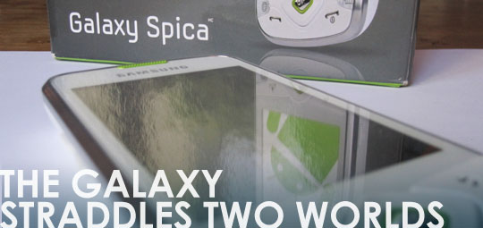
The Spica is one of the most recent Android phones from Samsung, and has been released on Rogers in Canada. It seems pretty obvious that Samsung and Rogers are aiming this at the lower end market, as the Spica can be had, as of this writing, for as little as $29.95 on contract, which makes it a viable alternative to zero dollar ‘dumb phones’. Rogers was kind enough to send us a review unit to put it through the wringer, and I have to say the Spica is an odd beast, even in the ever expanding Android universe. Is there a place for it?
Design
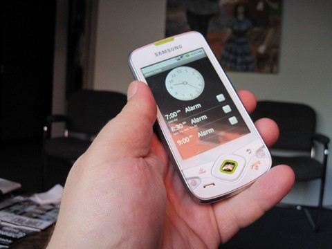
I have to admit, when I first took a look at the Spica, I wasn’t sure whether I liked it or not. Even after a week of use, I’m not so sure. Part of that is the the fact that I’m not sold on white plastic phones in general, and the chrome edge all around the device doesn’t help it. The phone is also chalk full of buttons, 11 in total. This could be a record number for a non-QWERTY phone, and I’m not counting the d-pad. When you add it all up, from a design point of view there’s a lot of ‘old school’ going on, at least on the surface. It’s not horrible, but in an era where elegant slabs of screen like HTC’s HD2 and EVO exist (though not officially in Canada), the Spica is a bit of a throw back. Speaking of backs, I do like the bump texture on the back of the phone. It’s just enough to supply some sort of grip. Overall, it’s decent enough, but it would be nice if Rogers offered the black version.
Hardware
At 115 x 57 x 13.2 the Spica is fairly unassuming, but it’s when you look under the hood where things get a bit more interesting. All the connectivity is there: GPRS, EDGE, HSDPA, Wi-Fi 802.11 b/g and Bluetooth 2.1 with A2DP. It also has built in GPS with A-GPS support, all of which functioned just fine in my tests. The touch screen is 3.2 inches, and HVGA (320 x 480). Though it’s not multitouch enabled, the capacitive screen responded well, and outdoor visibility was decent, though direct sunlight washes is out. I’ve never cared about direct sunlight tests. After all, how hard is it to turn your head in most situations to get rid of the glare? Sure, there may be special circumstances, but 99.9% of the time, it’s a non-issue.
The 3.2MP auto focus camera (no flash) felt a little dated. It did a decent job outdoors, but without a flash, lower light situations are more or less a no-go. I suspect that if the camera did have a flash, it would actually be decent indoors, but there’s no way you’ll feel comfortable leaving your cheap point n shoot camera at home. The video recording was pretty weak too, with a QVGA resolution and 15 FPS.
It’s a real shame about the camera, because the phone itself is powered by a 800MHz processor, which shows when running applications and playing back videos, including DivX and Xvid, with no problem. The processor definitely feels more snappy than most other low end Android phones, but not as fast as the high end ones available now. It’s also hampered by 128MB of RAM, and 180MB of internal memory, neither of which does the processor service, especially once you start really using it.
Software
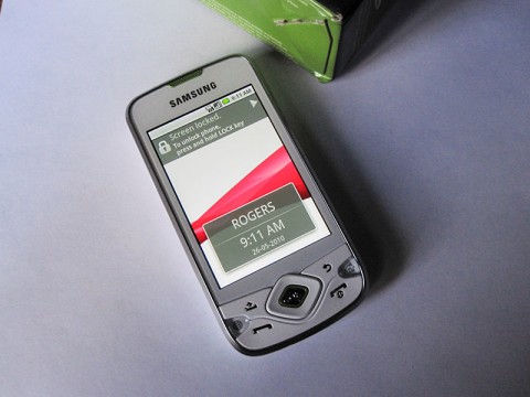
Unlike a lot of Android phones, the Spica is supplied with stock Android 1.5, with no custom UI enhancements whatsoever. Although Samsung announced back in March that the Spica will be getting the Android 2.1 upgrade, the phone as supplied by Rogers is still running the older 1.5 OS, aka Cupcake. I haven’t heard an announcement from Rogers regarding an update for their Spica yet, but hope it rolls out soon.
The few extras that do come with the phone aren’t bad though. The Rogers urmusic.ca application and service is a decent music destination, with track previews and standard pricing. The player is nice, and reminds me of a simpler version of the Zune on screen controls. The other bundled software, from Moxier, provides some pretty robust Exchange ActiveSync connectivity for those who need it, which covers email, contacts, tasks and calendar. All this goes beyond the standard Gmail setup when you launch an Android device for the first time, and really deserves it’s own in depth write up. Suffice to say that if you know and need such connectivity, it’s here in the Spica.
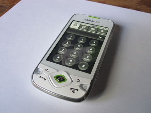
All the standard Android apps performed just fine: the browser, search and gmail, all seemed snappy enough, and the phone handles most games I threw at it well enough. The 3.2 inch screen is about as small as you’d want to see Android come with, as makes the on screen keyboard a bit tough to use, especially since it’s horribly outdated and of the “designed in Soviet Union” school of utilitarianism. Definitely search out an alternate keyboard, such as Better Keyboard, (just one of many options) to typing easier.
Due to the memory constraints, the very first thing you’ll need to download from the Android Marketplace is a task killer like Advanced Task Killer. Once you get a few apps running on this device, the low amount of memory is going to cause some noticeable sluggishness, so ATK is going to be your friend.
In The End
This is where pegging the Galaxy Spica i5700 becomes tough. On one hand, it’s processor performs better than other Android devices in it’s price range, and cheap phones are usually for the neophyte user. On the other, due to the lack of additional UI enhancements, and lack of memory, I can see how the phone might appeal to the more advanced smart phone user who’s aware of the pros and cons, and can work around using a task killer to keep their phone in smooth running form, especially if they want to keep their upfront hardware costs on the low end.
All this makes the Galaxy Spica a phone that straddles two Android worlds. Although it’s low price compared to some other smart phones may seem attractive to a lot of users, I’d say that its real target is someone who likes poking around their phone, and getting to the nuts and bolts of it. This is especially true if they know someone already using Android who can help them get around. Whether or not you have experience with Android itself, as long as you keep the memory issue in mind, this is a good, cost effective phone to enter the Android world. It doesn’t have the power of a Milestone or a Nexus One, or the UI polish of the many HTC offerings out there, but it’s clean and simple, without a lot of the overhead that some of the Android phones directly targeting the social media junkies out there.



[…] This post was mentioned on Twitter by Alex , rgbFilter. rgbFilter said: Samsung Galaxy Spica Review: The Spica is one of the most recent Android phones from Samsung, and has been release… http://bit.ly/9g0nJv […]